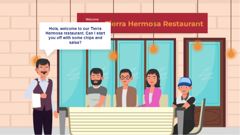
Discussing Menu Terminologies When Ordering Food
Title: Discussing Menu Terminologies When Ordering Food
Responsibilities: Instructional Design, Content Design, Multimedia Development and Production, Visual Design, eLearning Development.
Tools Used: Vyond, Adobe Illustrator, YouTube, Canva, Articulate Storyline 360, AI voice generator Murf AI
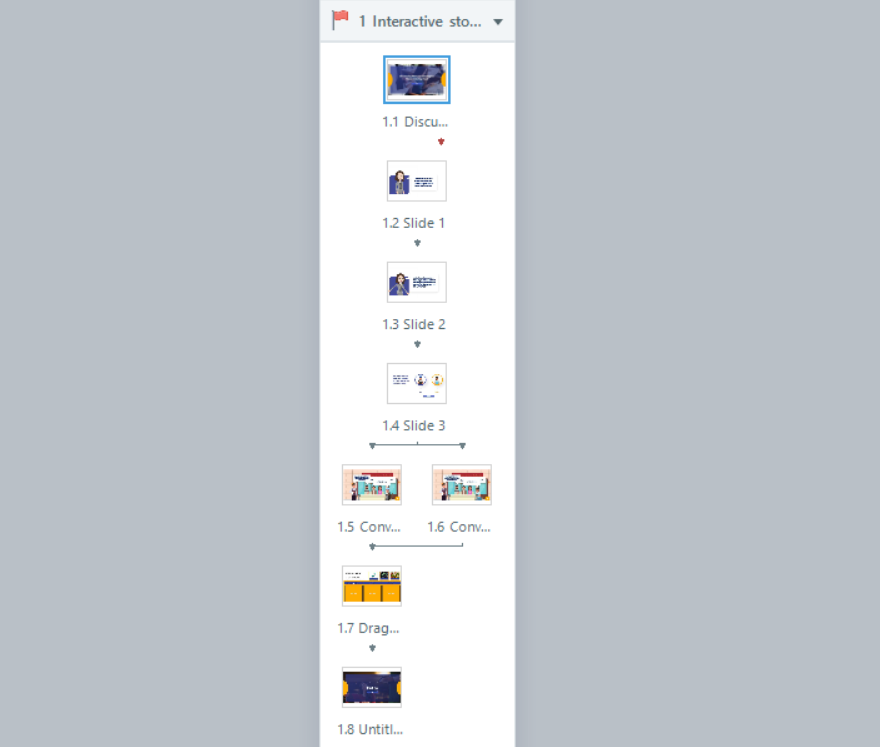
Slide 1.1:


Slide 1.2:
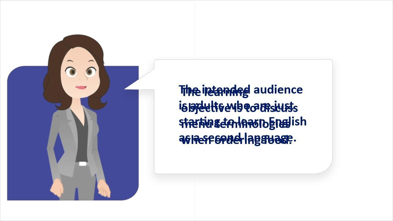

Slide 1.3:
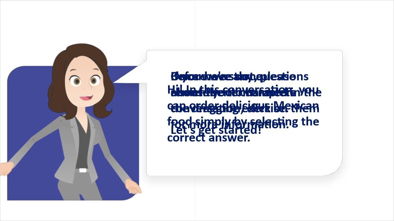

Slide 1.4:
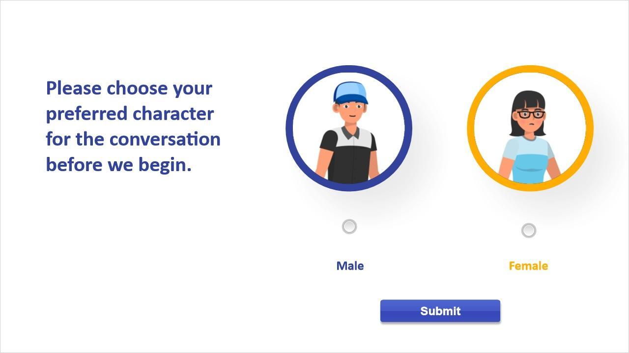
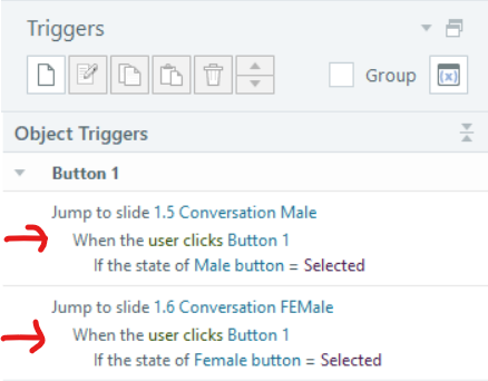
When the Submit button is clicked, it redirects you to the respective slide based on the choice you have made, whether it’s a male or female. Below is the trigger configuration for the Submit button.
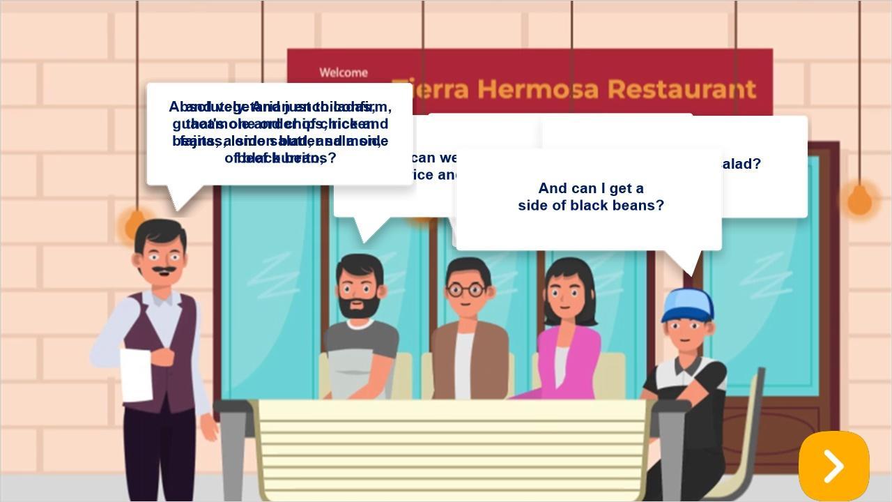
Slide 1.5:
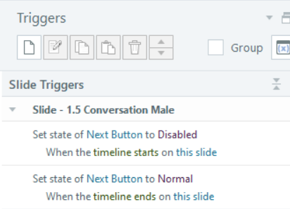
To prevent learners from skipping without listening to the entire video, triggers have been implemented to restrict skipping until the video has concluded. Please refer to the trigger below.
One trigger reveals a layer providing an explanation of “something to drink.” Please refer to this layer in the list of available layers below. Another trigger displays the “Side dishes” layer when clicked. A third trigger reveals the “Entrees” layer upon clicking.
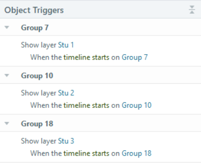
The other three layers titled “Stu 1”, “Stu 2” and “Stu 3” shows up after each of the three callout of the last man from left ends. Please see the below trigger.
Here is a list of layers in this slide:
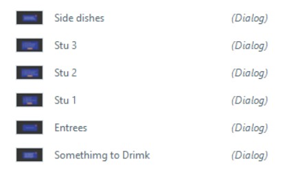
The remaining three layers named “Stu 1,” “Stu 2,” and “Stu 3” become visible after the completion of each of the three callouts from the last man on the right. Please review the trigger details provided below.
Presently, the three layers designated as “Stu 1,” “Stu 2,” and “Stu 3” contain a question when opened. I will elaborate on one slide below, emphasizing that all three layers share a consistent style.
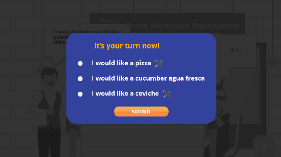
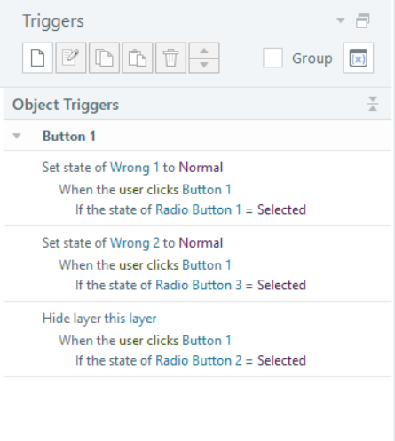
In this layer, there are three radio buttons accompanied by two cross images placed in front of the corresponding text. At the layer’s initiation, the cross images remain hidden. They are configured to appear only if the submit button is clicked and it is determined that one or more incorrect answers have been selected. Refer to the image below for a visual representation of the triggers set for the submit button.
Slide 1.6:

Slide 1.7:
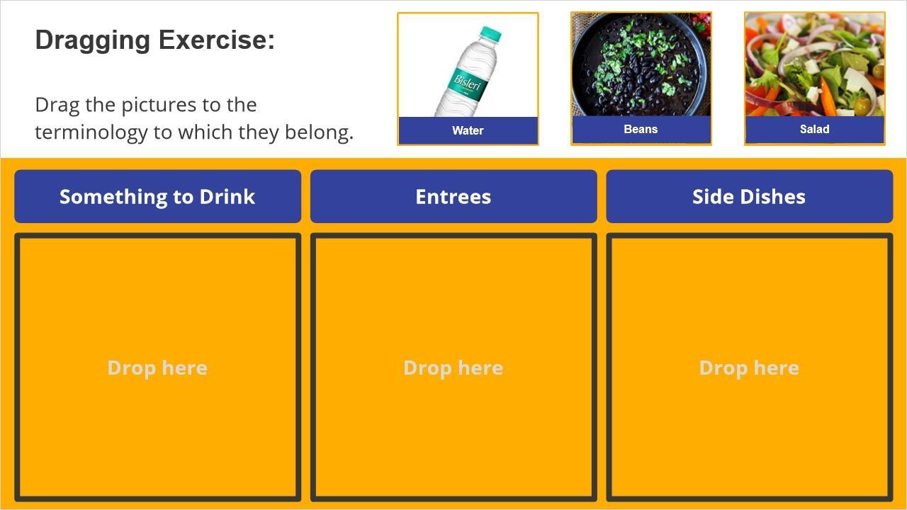
This interactive slide presents a drag-and-drop quiz with twelve draggable items, each comprising an image and a text-laden rectangle shape. Three drop targets are strategically placed, demonstrating the linkage between drag items and drop targets.
In this slide, there 12 layers, each equipped with voice-over for corresponding draggable items. The interaction is designed such that clicking on any of the 12 items reveals the specific layer associated with that item. Once the layer is displayed, the corresponding voice-over plays. Below is a list of the available layers along with their triggers:
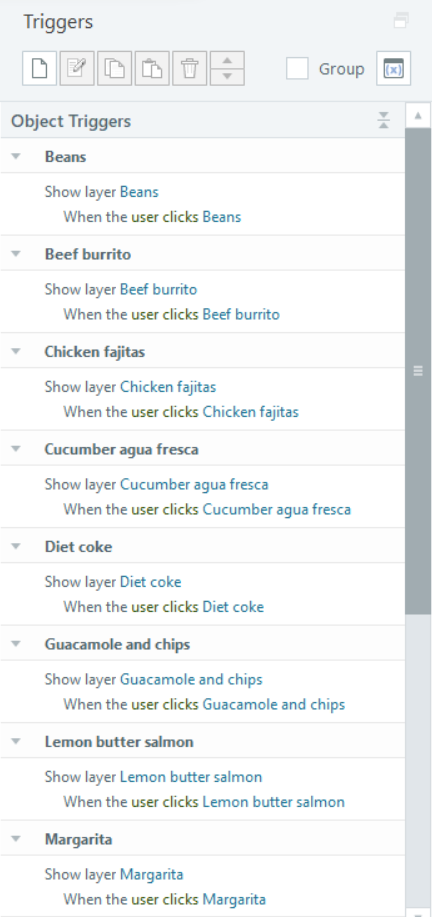
The interactive design ensures that users can engage with specific audio content related to each draggable item by triggering the corresponding layer. This approach enhances the user experience by providing targeted information in response to user actions.
Here is a list of draggable items versus drop target.
Drag Item | Drop Target |
Cucumber agua fresca | Something to Drink |
Water | Something to Drink |
Margarita | Something to Drink |
Diet coke | Something to Drink |
Chicken fajitas | Entrees |
Lemon butter salmon | Entrees |
Beef burrito | Entrees |
Vegetarian enchiladas | Entrees |
Guacamole and chips | Side Dishes |
Rice | Side Dishes |
Beans | Side Dishes |
Salad | Side Dishes |

The final slide includes a background image, two yellow-shaped images, and an exit button. Clicking the button allows users to conclude the tutorial.
Here is a trigger set for “Exit” button.
